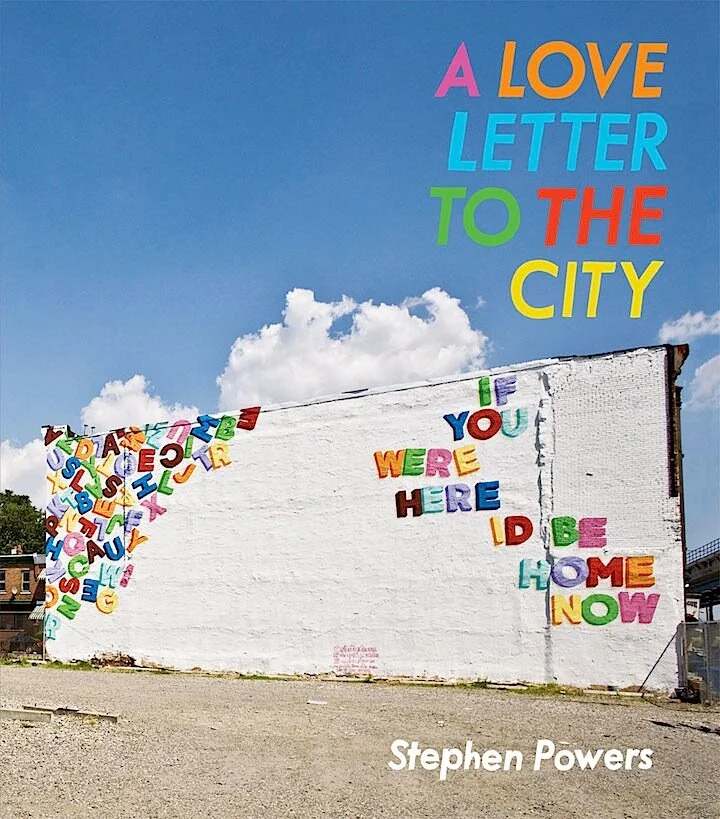
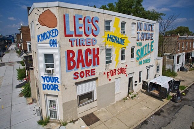
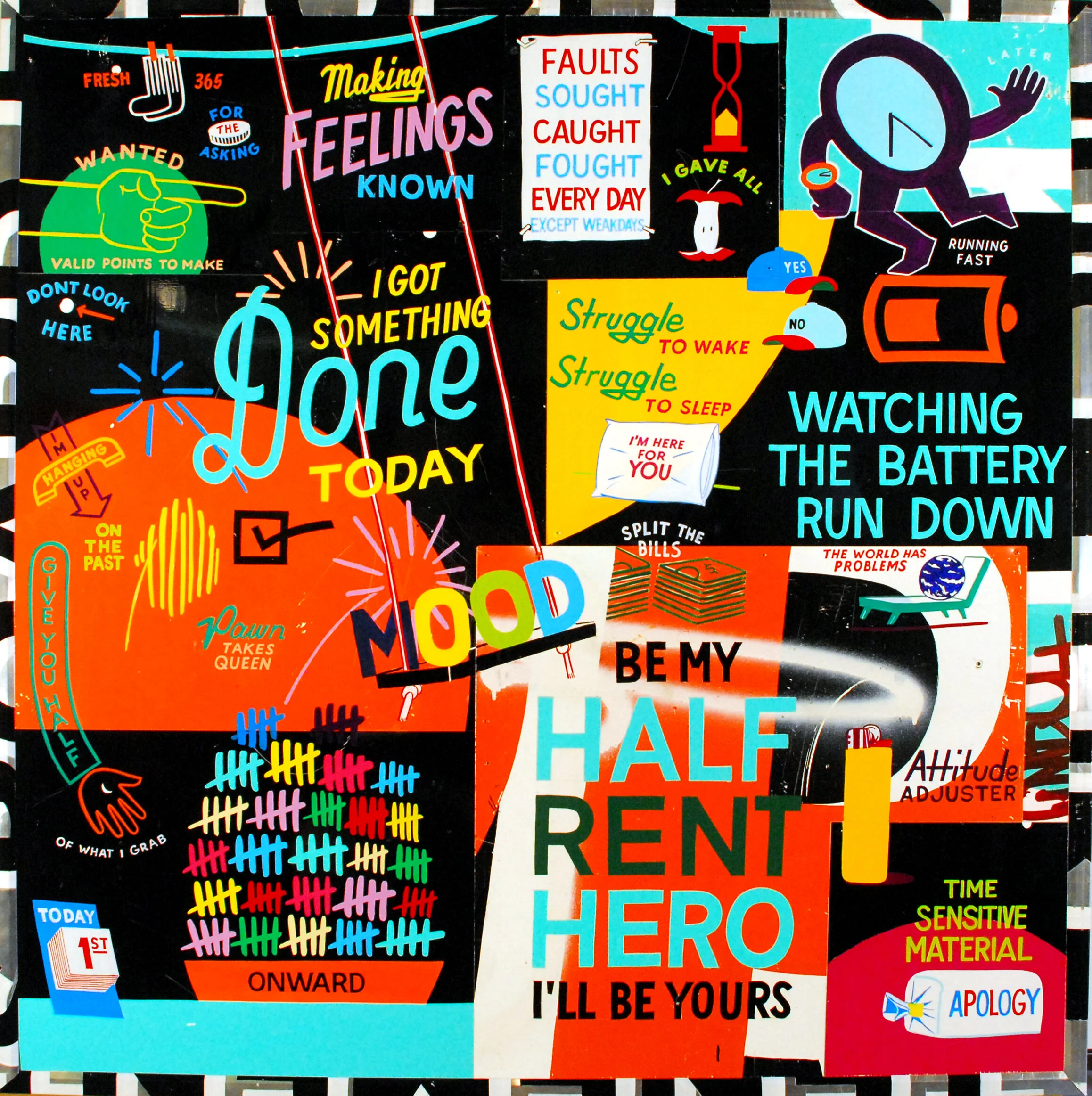
A friend in Philadelphia told me about Stephen Powers’ work and I’m so in love 😍😍😍
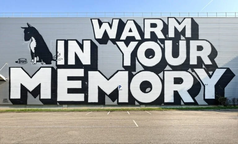
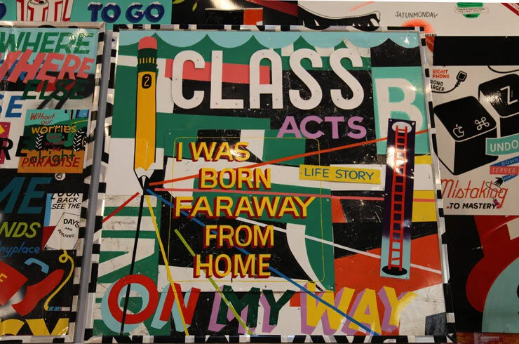
He’s an artist that’s works heavily with typography and if you know me, you know that’s my fave. His project, Love Letters is so inspiringly simple, it’s genius. Mainly bright colors and sentence fragments from would-be poems, the words leap from the wall. Why hasn’t anyone else done anything like this? Just proves that the perfect idea doesn’t have to be complicated Or multilayered, just one that resonates.
